Netflix UX research Case Study
Redefining viewing pleasure through intuitive UI/UX excellence.
Role
UX/UI Designer
Industry
Entertainment
Duration
2 weeks


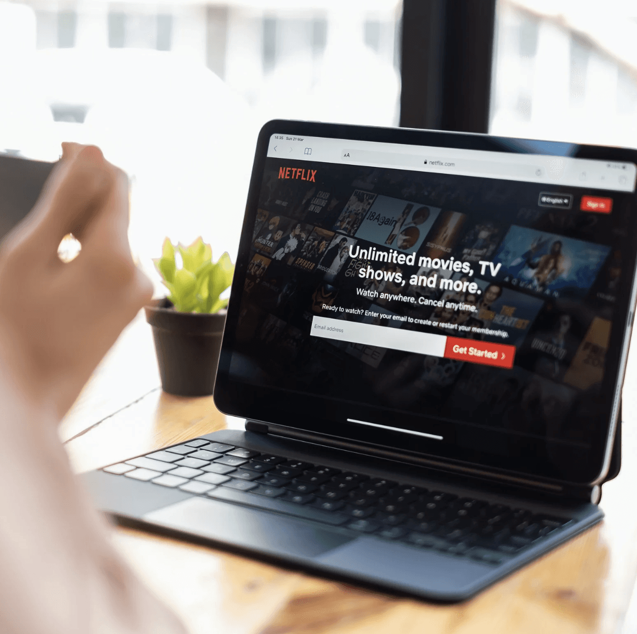
Landing Page
Problem:
Pricing details hidden in the FAQ section at the bottom of the landing page
User frustration leading to higher bounce rates


Solution:
Displaying prices prominently below the hero section
Helping users quickly assess if the product or service fits their budget
Simplifying the decision-making process
Building trust through transparency

Setup Page
Problem:
No social sign-in options on sign-up page
Longer sign-up processes
Higher abandonment rates
Missed opportunities for collecting valuable user data and personalization

Solution:
Including social sign-in options on sign-up page.
Allowing users to register quickly without filling out lengthy forms or remembering another password.
Enhancing trust and security.
Leading to higher conversion rates and better user engagement.

Payment Page
Problem:
Limiting payment options to only credit and debit cards
Alienating a significant segment of the audience, especially in regions where UPI or mobile payment apps are widely used

Solution:
Offering a range of payment methods
Enhancing user experience
Increasing conversion rates
Reducing cart abandonment

Button Visibility
Problem:
The "Explore All" button is hidden until a user hovers over the title section
Users might struggle to discover how to navigate to more content
Users might not realize that additional content is available if the button is not immediately visible

Solution:
Position the "Explore All" button on the left side
Move the content slider to the center
Ensure easy access to additional content, improving the user experience

Search History
Problem:
Searching for "The Game" movie on Netflix returns unrelated suggestions like "Return of the Dragon: Enter the Game of Death" or "Mission for the Dragon"
Clicking on these suggestions leads to frustration, as they may show that the content is unavailable
This impacts the user experience by providing irrelevant or misleading results

Solution:
If "The Game" is unavailable, suggest relevant alternatives like "Similar thrillers" or "More movies starring Michael Douglas"
Guide users to content that closely matches their interest instead of unrelated titles
Use more precise tagging and categorization to avoid broad or irrelevant matches
Ensure tags are clearly linked to the most relevant content, improving the accuracy of search results

Searched Movie Suggested Movies
Description Page
Problem:
Actor and movie details are placed at the bottom of the page, away from the main description
Name of the cast people were unable to catch up
Suggested videos interrupt the flow between the main content and actor details
This disrupts the user experience by scattering relevant information across the page

Solution:
Position actor photos and names directly below or beside the main movie/show description
Keep all relevant information together for seamless access
Enhance user experience by making it easier for users to find cast and crew details without unnecessary interruptions

Watch Screen
Problem:
No option to adjust video quality on streaming platform
Frustration for users with limited data plans or slower internet connections

Solution:
Provide an option to adjust video quality
Allow users to manage their data usage
Enhance the experience for users with constrained internet resources

Focused on optimizing streaming quality and user navigation through data-driven design enhancements, addressing key user frustrations.
Conclusion
Through my Netflix UX case study, I identified key pain points that impact user experience, including overwhelming navigation, accessibility gaps, and content management challenges. By implementing solutions such as streamlined navigation, improved accessibility features, and better content organization tools, I aimed to create a more user-friendly and engaging experience. This project reinforced the importance of user-centered design in solving real-world frustrations. By leveraging research, usability testing, and iterative design, I was able to develop solutions that enhance content discovery, simplify interactions, and improve accessibility. With these enhancements, Netflix can provide a more intuitive, inclusive, and efficient streaming experience—ensuring users spend less time searching and more time enjoying their favorite content.


Other projects
Foodlicious
Built an online food ordering system with a user-friendly interface and efficient admin tools for managing menus, pricing, and order fulfillment.
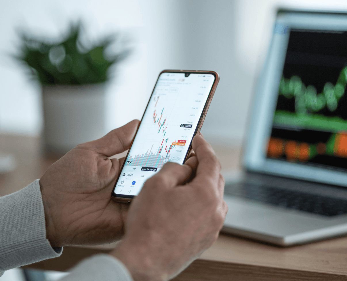
Main Project: Simple Invest
Crafted and improved Simple Invest's UI through user research, elevating user engagement and satisfaction with a seamless, user-friendly design.